Creación y personalización de una gráfica en Matplotlib — 12:05 min
12:05 min | Última modificación: Octubre 6, 2021
Matplotlib es una de las principales librerías utilizadas para graficación de datos en Python. En este tutorial se explica como crear y personalizar un gráfico simple.
Matplotlib cheatsheets: https://github.com/matplotlib/cheatsheets#cheatsheets
Datos
[1]:
#
# Se desean graficar las ventas mensuales en $.
# Las cantidades están en K
#
data = {
    "month": [
        "jan",
        "feb",
        "mar",
        "apr",
        "may",
        "jun",
        "jul",
        "aug",
        "sep",
        "oct",
        "nov",
        "dic",
    ],
    "amount": [333, 335, 445, 475, 560, 720, 950, 1090, 1380, 1162, 934, 860],
}
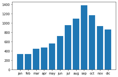
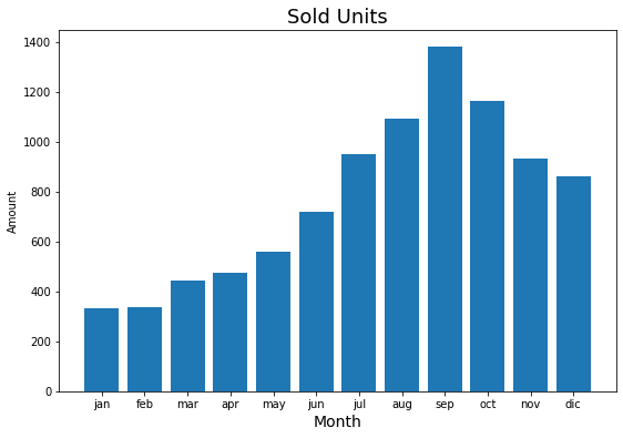
Gráfico inicial
[2]:
#
# Se verifica que se tenga una gráfica con
# valores de sus parámetros por defecto.
#
import matplotlib.pyplot as plt

plt.bar(
    x="month",
    height="amount",
    width=0.8,
    bottom=None,
    data=data,
)

plt.show()
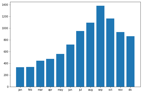
Paso 1: Tamaño del gráfico
[3]:
#
# Paso 1: se ajusta el tamaño del grafico.
#
plt.figure(figsize=(9, 6))

plt.bar(
    x="month",
    height="amount",
    width=0.8,
    bottom=None,
    data=data,
)

plt.show()
Paso 2: Se agrega el títulos y los nombres de los ejes.
[4]:
plt.figure(figsize=(9, 6))

plt.bar(
    x="month",
    height="amount",
    width=0.8,
    bottom=None,
    data=data,
)

plt.title("Sold Units", fontsize=18)
plt.xlabel("Month", fontsize=14)
plt.ylabel("Amount")

plt.show()
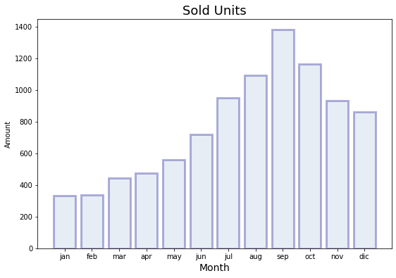
Paso 3: Se personalizan las barras
[5]:
plt.figure(figsize=(9, 6))

plt.bar(
    x="month",
    height="amount",
    width=0.8,
    bottom=None,
    data=data,
    #
    color="lightsteelblue",
    alpha=0.3,
    edgecolor="darkblue",
    linewidth=3,
)

plt.title("Sold Units", fontsize=18)
plt.xlabel("Month", fontsize=14)
plt.ylabel("Amount")

plt.show()
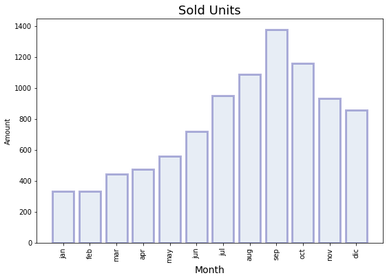
Paso 4: Se formatea el eje X
[7]:
plt.figure(figsize=(9, 6))

plt.bar(
    x="month",
    height="amount",
    width=0.8,
    bottom=None,
    data=data,
    #
    color="lightsteelblue",
    alpha=0.3,
    edgecolor="darkblue",
    linewidth=3,
)

plt.title("Sold Units", fontsize=18)
plt.xlabel("Month", fontsize=14)
plt.ylabel("Amount")

plt.xticks(rotation="vertical")

plt.show()
Paso 5: Se formatea el eje Y
[8]:
import matplotlib.ticker as tick

plt.figure(figsize=(9, 6))

plt.bar(
    x="month",
    height="amount",
    width=0.8,
    bottom=None,
    data=data,
    #
    color="lightsteelblue",
    alpha=0.3,
    edgecolor="darkblue",
    linewidth=3,
)

plt.title("Sold Units", fontsize=18)
plt.xlabel("Month", fontsize=14)
plt.ylabel("Amount")

plt.xticks(rotation="vertical")

#
# Función para formatear la cantidad. Note
# que retorna un string
#
def yaxis_format(y_value, y_position):
    if y_value >= 1e3:
        y_formated = "$ {:1.1f} M".format(y_value * 1e-3)
    else:
        y_formated = "$ {:3.0f} K".format(y_value)
    return y_formated


plt.gca().yaxis.set_major_formatter(
    tick.FuncFormatter(yaxis_format),
)

#
# Límites del eje Y
#
plt.gca().set_ylim(200, 1400)

plt.show()
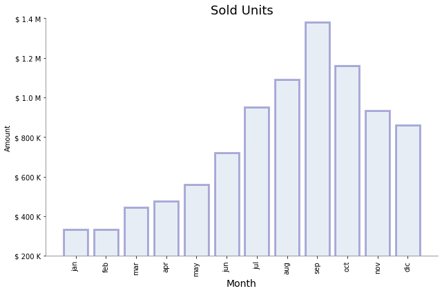
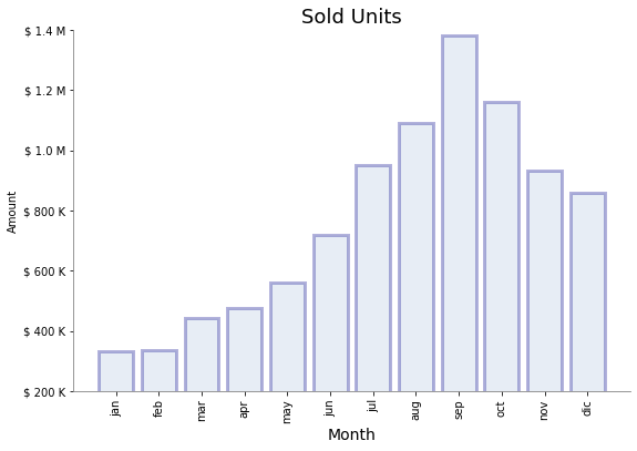
Paso 6: Se formatea el fondo
[9]:
plt.figure(figsize=(9, 6))

plt.bar(
    x="month",
    height="amount",
    width=0.8,
    bottom=None,
    data=data,
    #
    color="lightsteelblue",
    alpha=0.3,
    edgecolor="darkblue",
    linewidth=3,
)

plt.title("Sold Units", fontsize=18)
plt.xlabel("Month", fontsize=14)
plt.ylabel("Amount")

plt.xticks(rotation="vertical")


def yaxis_format(y_value, y_position):
    if y_value >= 1e3:
        y_formated = "$ {:1.1f} M".format(y_value * 1e-3)
    else:
        y_formated = "$ {:3.0f} K".format(y_value)
    return y_formated


plt.gca().yaxis.set_major_formatter(
    tick.FuncFormatter(yaxis_format),
)

plt.gca().set_ylim(200, 1400)

plt.gca().spines["left"].set_color("gray")
plt.gca().spines["bottom"].set_color("gray")
plt.gca().spines["top"].set_visible(False)
plt.gca().spines["right"].set_visible(False)

plt.show()
Paso 7: Se ajusta el tamaño de la figura
[10]:
plt.figure(figsize=(9, 6))

plt.bar(
    x="month",
    height="amount",
    width=0.8,
    bottom=None,
    data=data,
    #
    color="lightsteelblue",
    alpha=0.3,
    edgecolor="darkblue",
    linewidth=3,
)

plt.title("Sold Units", fontsize=18)
plt.xlabel("Month", fontsize=14)
plt.ylabel("Amount")

plt.xticks(rotation="vertical")


def yaxis_format(y_value, y_position):
    if y_value >= 1e3:
        y_formated = "$ {:1.1f} M".format(y_value * 1e-3)
    else:
        y_formated = "$ {:3.0f} K".format(y_value)
    return y_formated


plt.gca().yaxis.set_major_formatter(
    tick.FuncFormatter(yaxis_format),
)

plt.gca().set_ylim(200, 1400)

plt.gca().spines["left"].set_color("gray")
plt.gca().spines["bottom"].set_color("gray")
plt.gca().spines["top"].set_visible(False)
plt.gca().spines["right"].set_visible(False)

plt.tight_layout()

plt.show()